Thursday, May 2, 2013
Thursday, April 25, 2013
Preliminary DNA sketches
This is my home page sketches and my topic is
what I love most of all, food. I’m a firm believer of eating healthy for the
most part. I’ve recently got into foods that are good for particular parts of
my body like, my muscles, nerves, eyes, liver etc.
With this curiosity of feeding parts of my body
I thought about what foods are good for my genes, which narrowed down my topic to
how to feed your DNA.
So the main focus will be a photo of a human’s
DNA and it
Will have navigation buttons on the sides of the
photo with labels that read foods that are good for your DNA.
In the second and third sketch are the
preliminary ideas for my layout and font locations.
Monday, April 15, 2013
Car Pollution
I chose Car pollution as
my topic because it causes harm in sustaining the environment.
In the front cover of this
E-card I put together a line of cars in a secluded beach spot. I wanted to
capture the idea going on vacation to enjoy a natural and beautiful beach but
imply that if we don’t control car pollution it can destroy areas where we
least expect it.
In
this second image I wanted to show that car pollution could also hit you at
home. This image is to bring across the idea of opening your living window for
fresh air will be the same as having a car running.
In
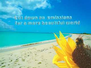
this last image I am presenting a happy ending to the E-card. A clean and beautiful environment will remain if we stop car pollution.

Monday, April 8, 2013
Car pollution sketches
In my first sketch is a scene with a person
standing on a beach and a stream of cars driving through it. I will apply Lens blur
and focus effects to this portrait. I will apply blur to the person and some of
the ocean background to bring attention to the cars driving through the beach.
In the next two sketches are possibilities for the
inside of the E-card. The first is a giant SUV placed in a living room. I don’t
think I like this idea very much because it seems a bit weird to be the inside
of the card? But maybe weird is good…
I guess it can work if I use text that says, “Stop
pollution from reaching your living room”?
The next sketch
is a series of transportation options to lower car pollutions. It is straightforward and a clear
design and probably what I will go with.
The last sketch
will be the back cover of the card, which is the beach completely empty except
a flower growing out of the sand. I like the idea of a flower in the sand
because it is stating that if we kept pollution down anything can grow
anywhere. This may not make much sense for the card but we will see what will
happen after your feedback.
Wednesday, March 27, 2013
Leo Brouwer Final Book Cover
Here is my final book cover of the classical composer Leo
Brouwer. I will start with my color scheme which is a burnt orange. I choose this color because it brings out
the back and white photo of the artist. It makes it contemporary yet old
fashion, plus it catches the eye. In my typography I used two types of font, Slom
which has a standard font and School house Cursive B which is a type of script.
I used a yellow color so that there is a contrast effect to the background color.
The black and white photo I kept in a grayscale and did plenty
of touching up on his face, legs and hands. The original photo was taken at a low
quality so I increased the resolution to about 300 and manually adjusted the
brightness/contrast.
I also did not have InDesign and did the best I could with aligning and measurements. I was trying to design a book that was mysterious
and unique well maintaining a classical feel. I hope I got close!
Friday, March 22, 2013
Tuesday, March 12, 2013
Awareness Poster:Childhood Obesity
Childhood obesity is a growing issue in the United States
for quite some time. Last semester I did a research paper on obesity affecting
children and adults.
According to the CDC Childhood obesity has doubled in the last 30 years.
Childhood obesity is not a complicated issue to understand that
is why I wanted to make a very simple and clear poster. I used a very bright
yellow back ground so the photo of the child pops out at the viewer. The text is black and bold highlighting the
word STOP so that it also grabs your attention.
I believe that I was able to execute my message across by
having a child handing away an apple as she reaches for the giant stick of
butter. When parents see this poster it
is clear that children should be eating more fruits than fats.
Marni Zalben for photo of young child (Penny Zalben)
Allan Avidano for Buttering sketch
Subscribe to:
Posts (Atom)


